

Deciding where to build the next generation of clean steel plants is, increasingly, a decision about electricity. Once you make iron and steel with clean power instead of coal, the single biggest swing factor in your cost base is how cheap, and how reliable, that power is where you stand. The same goes for any energy-hungry operation that has to run around the clock, from chemical works to data centres.
So, the question that quietly decides billions in investment is a simple one: at this location, what would it actually cost to run a constant industrial load entirely on renewables?
Until recently there was no good way to answer it. You could get hand-wavy global averages, the “solar is cheap now” kind, or you could pay for a slow, bespoke feasibility study for a single site. Nothing in between told you, for any point on the map, what a system sized to your demand and your reliability needs would really cost.
That gap is what the Baseload Optimisation Atlas closes. It works out the cheapest renewable system for any location on Earth: drop a pin and it returns the lowest-cost mix of solar, wind and battery storage that keeps a constant load running reliably, as a cost per unit of electricity you can compare like-for-like anywhere in the world. It is one part of Steel-IQ, Systemiq’s open-source model of the global steel sector, surfaced as an interactive map that anyone can explore.
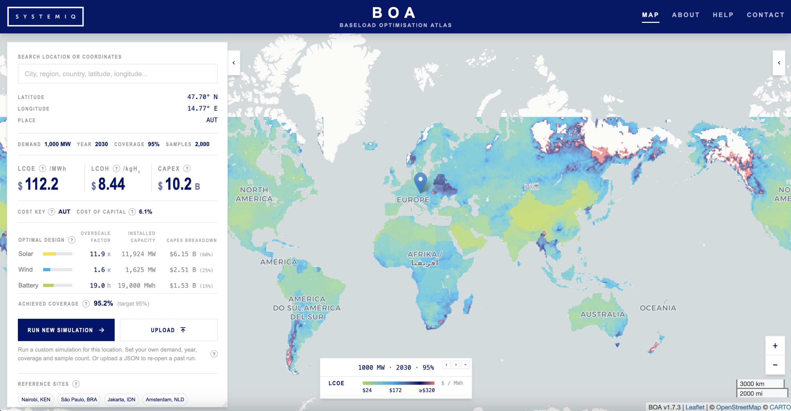
The cheapest renewable system for a constant industrial load, mapped for every location (shown here at high reliability for a 2030 build). Explore it live at boa.systemiq.earth
Why we built it
At Systemiq, we kept running into the same question in our work with industrial developers, investors and public funders weighing up clean steel: where can this actually be done cheaply? The honest answer was that no one had a fast, transparent, global way to compare places on the one input that increasingly decides the outcome, the cost of firm, clean power. People were either flying blind on averages or commissioning slow, expensive one-off studies. We wanted a first-pass answer for anywhere on Earth, grounded in real weather and cost data, that you could interrogate and challenge rather than take on trust.
And it shows a surprising insight: the lowest-cost clean power is concentrated in a fairly small set of regions.
What it shows
The map makes visible patterns that global averages flatten out. The cheapest places to run a constant load on renewables are not simply the sunniest. They are the places where strong sun sits alongside steady, moderate wind, so you need far less battery storage to cover the quiet hours. Central China, North Africa, the Arabian Peninsula and parts of southern South America stand out. Places with fierce but gusty wind, like Patagonia or northern Europe, generate plenty of power but need so much storage to smooth it out that total costs climb.
That concentration of cheap renewables is one of the forces likely to pull green ironmaking towards sun-and-wind-rich geographies such as the Gulf and North Africa, while higher-cost regions weigh up importing green iron instead of making it at home.
Time also redraws the map. Ask the same question for 2050 rather than today and many locations that look marginal now become competitive. The biggest reason is falling battery costs: cheaper storage means you can lean on intermittent sun and wind without overbuilding, and that is exactly what shifts the economics for industry.
How it works
Let’s say you wanted to run a toy factory on the North Pole powered by renewables and are trying to understand what your levelized cost of electricity would be. The baseload demand for a large toy factory is around 1.2 MW. You would select your location in Greenland in the Baseload Optimization Atlas, set your demand, and run the simulation.
Under the bonnet, the Atlas does two things for every location. First, it reads in a full year of local weather, hour by hour, from global records, so it knows how much sun and wind that exact spot actually gets, factoring in any snowstorms and arctic nights. It translates this weather data into solar and wind capacity by simulating how much energy a solar panel or wind turbine could produce under those conditions. Then it tests thousands of possible system designs, different combinations of solar, wind and battery, runs each one across the whole year, discards any that cannot keep the load running to the chosen reliability target, and keeps the cheapest design that survives.
In our case you would see a resulting LCOE of around $75/MW, and that you would need to install around 5,000 MW solar panels, 2,000 MW of wind turbines, and 29,000 MWh of energy storage, resulting in an investment cost of around $8 billion.
This is far quicker than formal optimisation while landing on answers that are close enough to optimality, quick enough to pre-compute the entire world and serve it as a live map. The default view assumes a one-gigawatt constant load, roughly an average integrated steel plant, but you can run custom cases for different demand sizes as in our example, as well as different build years between 2025 and 2050, and reliability levels.
The inputs behind it are all published and traceable:
| What it uses | Where it comes from |
| A full year of local weather (sun, wind, temperature), hour by hour, for every location | Global weather records (Copernicus ERA5 reanalysis) |
| How solar, wind and battery costs fall over time | Published long-term scenario projections, corrected against real-world deployment (IIASA and IRENA) |
| Local financing costs | Country-level cost-of-capital estimates |
What it doesn’t tell you yet
A first-pass tool has limits worth being honest about. The Atlas assumes a site runs fully off-grid and never sells surplus power back; in reality, most industrial sites have some grid connection, which would cut storage needs and lower costs. Land constraints are simplified, so it screens terrain and water but not protected or agricultural land, which can overstate how much can actually be built in crowded regions. Costs beyond the mid-2030s are genuinely uncertain, since they extrapolate today’s trends and a technology breakthrough could move them. And it uses a single representative weather year, so the year-to-year swings that matter for sizing storage are not yet captured.
Try it
The Atlas is live at boa.systemiq.earth, and the global layer is free to explore. For custom runs (your demand, your location, your scenario), get in touch at [email protected]. The Atlas is part of Steel-IQ, which is open source on GitHub.
This blog is written by Artem Baroyan and Ioana Simon

